Keep the Bull. Lose the Clutter. Why the Best Rebrands of 2026 Changed Less Than You Think
October 18, 2026
Your marketing might be working. For someone else.
Picture this. You fund a trade ad, a stand at the big expo, a run of LinkedIn posts. A buyer sees it, remembers it, and then credits it to your competitor.
That isn't paranoia. It's in the data. The LinkedIn B2B Institute worked with neuroscience firm MediaScience, using eye-tracking, skin response and brain sensors on nearly 800 people watching more than 100 ads. The headline finding: only around 19% of viewers could attach an ad to the right brand. So roughly four in five B2B ads fail to do the one job they were paid for.
The detail is worse. Dell's blue-toned ads saw about 25% of their attribution go to other brands that also use blue, namely Microsoft, Amazon and IBM. Dell paid. Its competitors collected.
Now think about your sector. How many engineering firms run navy and grey? How many logistics brands use a swoosh? How many manufacturers lead with a stock photo of a hard hat? If you look like the category, the category gets the credit.
What Novo did with its bull
On 14 September 2026, Novo Nordisk announced it would go by a single word: Novo. The legal name stays Novo Nordisk A/S, but day to day, "Nordisk" is gone. The wordmark is now lowercase. There's a more vivid blue called Lasting Blue, a new accent called Now Turquoise, a custom typeface and a new line, "Lasting Health Starts Now". The rebrand also launched with an updated set of cultural principles, The Novo Way, so the change went beyond the logo.
Here's the part to notice. The Apis bull, which the company has used since the 1920s, stayed. It was redrawn and now faces right instead of left, but it's still the bull. A hundred years of recognition, kept and sharpened.
This is a business under real competitive pressure, especially from Eli Lilly in obesity drugs, and Lilly is increasingly calling itself plain "Lilly" too. When the pressure was on, Novo didn't reach for a blank page. It cut what was slowing it down and kept what people already knew.
What Coca-Cola did with its ribbon
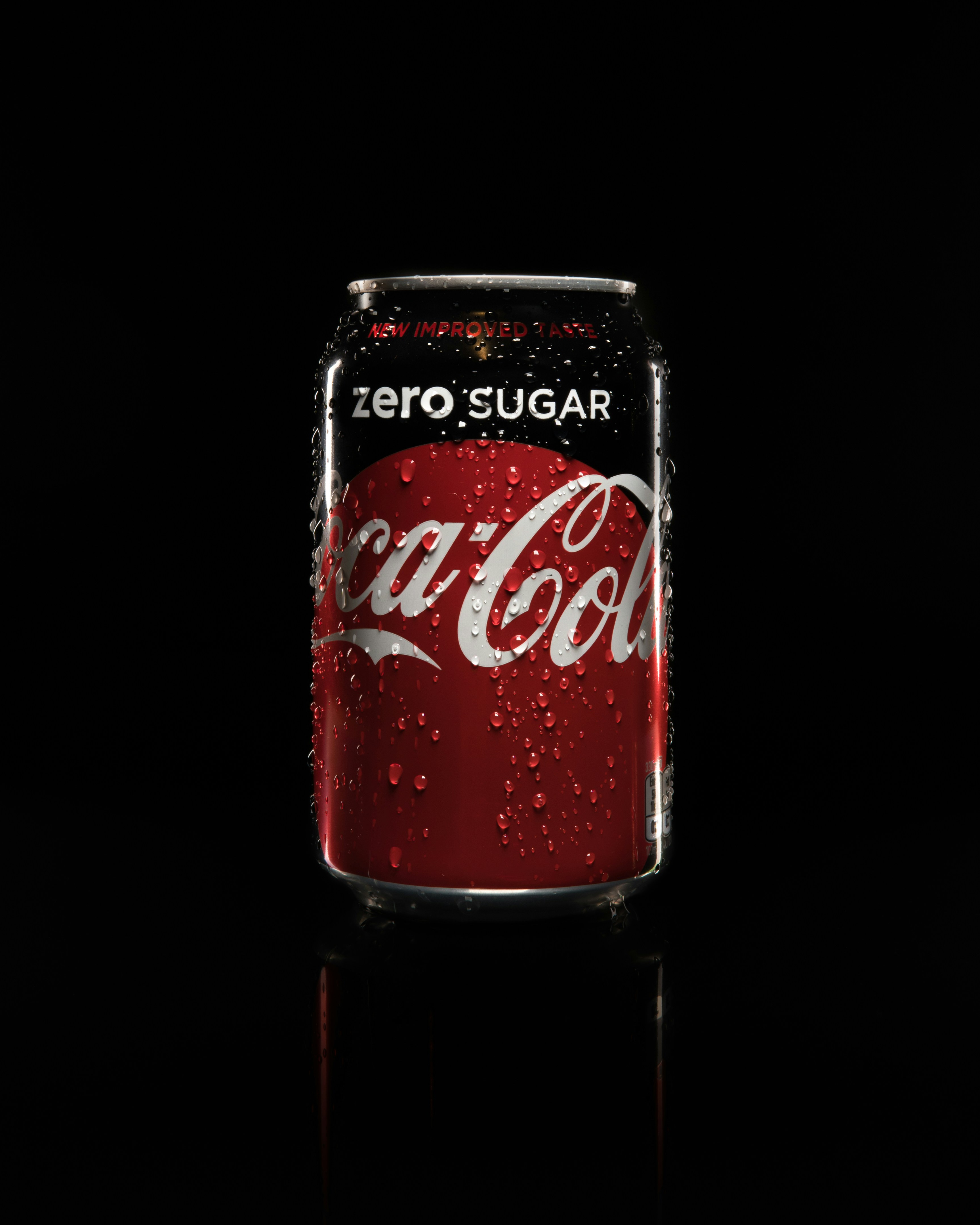
In July 2026, Coca-Cola rolled out a new global visual system across more than 200 markets, with North America following in 2027. You'd struggle to spot a new logo, because there isn't one. The company turned up the assets it already owned: the red and white, the Spencerian script, the Dynamic Ribbon, the Arden Square. On cans, the wordmark goes back to running vertically. Zero Sugar gets a black ribbon and a black cap so it reads instantly on the shelf.
One of the biggest manufacturers in the world, with every option open to it, decided the smartest move was consistency. The same assets, used the same way, everywhere.
Turning up what you already own is often smarter industrial branding than starting again.
The lesson for an industrial business
Most industrial brands have the opposite problem to Novo and Coca-Cola. They don't have a bull or a ribbon. They have a logo from 2004, three shades of blue depending on who made the brochure, and a website that looks nothing like the trucks.
That's why buyers misremember you. Without a distinctive asset used consistently, your marketing just tops up the category's memory, and the biggest name in that category takes the benefit. It matters, because the same B2B Institute work found that 86% of buyers start with a shortlist already in their head, usually about three brands. If you aren't on it, your odds of winning drop to around 8%.
So here's the job, in order.
Audit before you design. List everything that could be recognisably yours: a colour, a shape, a symbol, a phrase, a way of photographing your work. Ask customers what they actually remember. Strategy before design, always.
Keep what has earned its place. If something already carries recognition, sharpen it, the way Novo turned its bull around. Don't throw away years of memory because the board fancies a change.
Cut what blends in. If your colours and imagery could belong to any competitor, they're working for all of them. Salesforce found its character Astro added a 6% lift in correct attribution. Distinctive is the point.
Then be relentless. Same assets on the tender document, the van, the hi-vis, the website, the stand. Coca-Cola's whole refresh was about consistency at scale. You can do the same at your scale.
Find out where you're leaking credit
You're great at what you do. But if buyers can't tell your work from the next firm's, your brand is handing work to someone else every week.
Take nim's free 2-minute Industrial Brand Health Check. It scores where your brand is costing you work and shows you what to fix first. It's a sensible place to start before anyone opens a design file.
If you are considering brand or marketing services, view our products and pricing here.
Case studies