2026 got a nickname. The year of the B2B rebrand.
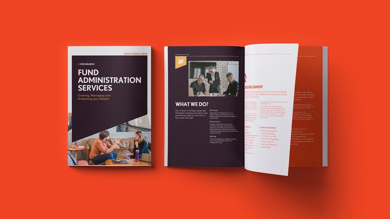
Walk through any industrial sector right now and you will see it. New logos. New colour palettes. New websites with big type and a drone shot over the yard. After a decade of hiding behind stock photography and jargon, industrial businesses are finally dressing up.
Here is the problem. Most of them are doing it in the wrong order.
The backwards rebrand
The standard sequence goes like this. Someone decides the logo looks dated. A designer gets briefed. Three options come back. The board picks one. New brochure, new signage, new website, job done.
Nothing about what the business actually stands for was ever discussed.
So you end up with a sharper looking version of the same vague promise. "Quality you can trust." "Your partner in manufacturing." "Excellence since 1974." The font changed. The pitch did not.
That is expensive decoration. And it does not survive a tender.
Dull is not a design problem
There is hard money attached to this. Research by Adam Morgan and Peter Field with System1, called The Extraordinary Cost of Dull, found that dull advertising needs up to 2.6 times more media spend to shift market share the same distance as interesting work. Interesting work generated 6.1 times more share growth than dull, purely rational work. In B2B specifically, around 60 percent of ads leave people feeling nothing at all.
Read that again. Nothing at all.
A new logo does not fix nothing at all. Nothing at all is a positioning failure. You have not decided what you are for, who you are for, or what you are willing to be worse at than the next supplier. No typeface rescues that.
What positioning-first actually looks like
Two industrial examples from the last few weeks.
In July 2026, Continental Carbonic relaunched as Nippon Sanso Carbonic Products. On the surface, a name change. Underneath, a repositioning. The company stopped presenting itself as a dry ice supplier and started presenting itself as a temperature control partner to food processors, pharmaceutical manufacturers, healthcare organisations, logistics providers and industrial cleaning contractors, backed by more than 40 facilities and its own fleet. Same dry ice. Completely different question being answered. Not "what do you sell" but "what problem do you own".
This is the order that works in industrial branding: position first, then the name, then the look.
Then Graham Engineering in Nelson, Lancashire, which launched a refreshed identity on 13 July 2026. The business runs a 330,000 square foot facility doing fabrication, welding, precision machining and deep draw pressing for defence, nuclear, aerospace and medical customers. Their rebrand is pinned to something concrete: sustained investment in people, facilities and engineering capability, plus approvals including DIN 2303 Class Q2 for military welding. The identity is the last mile. The credentials came first, and the new look was built to carry them.
That is the tell. In both cases you could delete the logo and the story would still stand up.
Go one step further and look at GF Smith, the British paper manufacturer with more than 135 years behind it. Before designing anything, agency Templo worked through the company's people, culture, values and purpose. The result was a challenger identity in a category that had gone quiet, with a colour palette pulled straight from the company's own Colorplan range. The product became the identity. That only happens when strategy runs first.
The cost of skipping it
Jaguar is the cautionary tale everyone points at, and the numbers back it up. Media intelligence firm CARMA tracked sentiment across the rebrand and found positive sentiment fell from 23.1 percent to 8 percent, while negative sentiment climbed from 21 percent to 40.3 percent.
The lesson is not "do not be bold". The lesson is that when you change how you look faster than you explain what you now mean, people fill the gap with their own story. Usually an unkind one.
The order that works
Run a rebrand like a build, not a paint job.
1. Positioning. What do you own that a competitor could not claim with a straight face? Get specific. "Precision machining for nuclear" beats "engineering solutions" every time. 2. Proof. What evidence backs it? Certifications, tolerances, uptime figures, on-time delivery, client retention, lead times. Facts, not adjectives. 3. Messaging. Say it in one sentence a buyer could repeat to their boss without notes. 4. Identity. Now you design. The look should make the position obvious in about three seconds. 5. Rollout. Website, tender documents, truck livery, factory signage, LinkedIn, quote templates, uniforms. Consistency is where the value compounds.
Most industrial businesses skip one to three, then wonder why four did not work.
Start with a diagnosis, not a logo
You cannot fix positioning you have never measured. Before you brief a single logo option, find out where your brand is quietly leaking work.
Our free 2-minute Industrial Brand Health Check scores your brand across the places buyers actually judge you, and tells you what to fix first. No pitch, just a straight read.
Take it here: https://www.nimcreative.com/brand-health-check
If you are considering brand or marketing services, view our products and pricing here.
Case studies