The biggest brand move of 2026 changed almost nothing
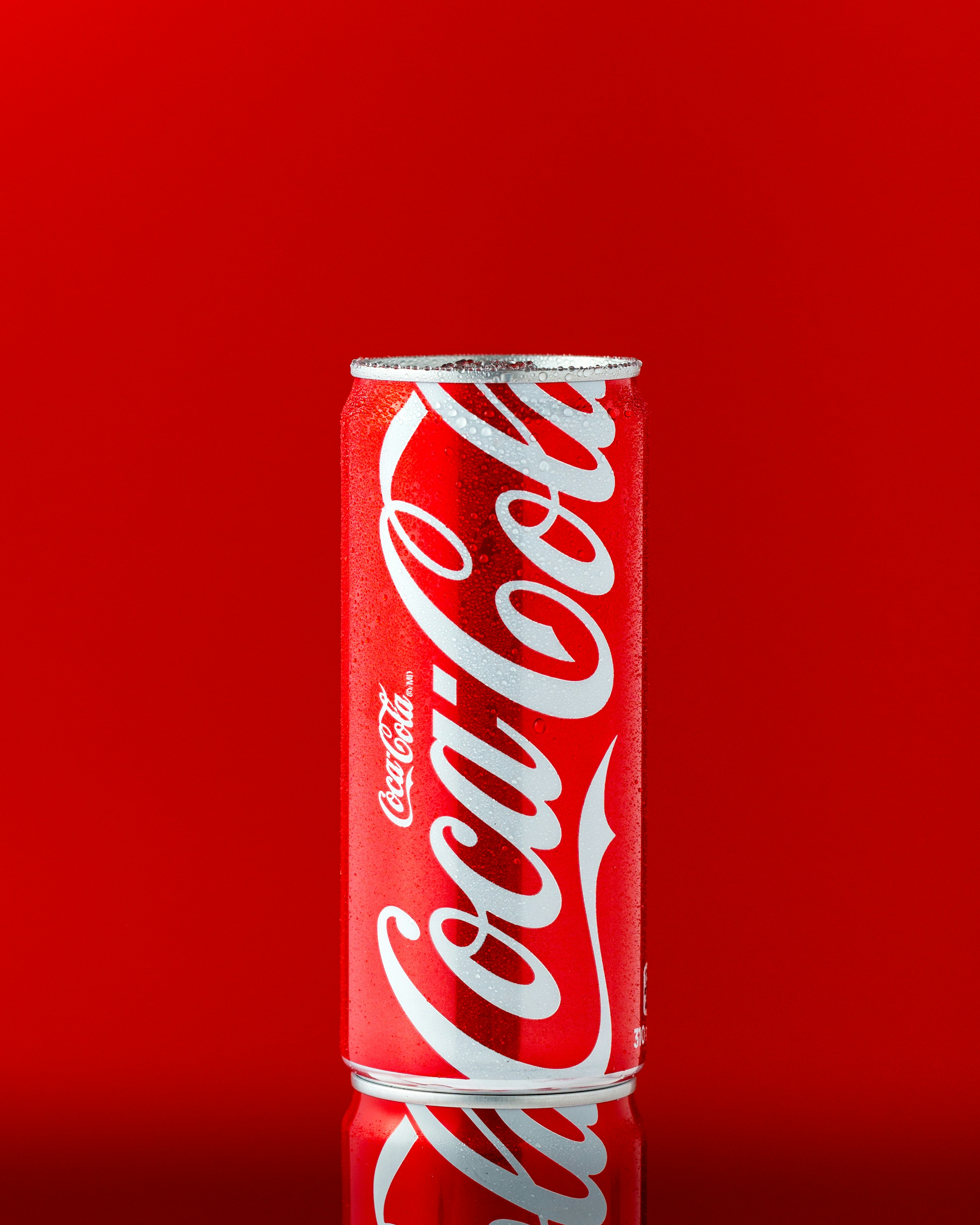
On 20 July 2026, Coca-Cola launched a new global visual identity system across more than 200 markets, built with agency JKR.
Here is the surprising part. They did not invent a new logo. They did not chase a new colour. The red and white, the Spencerian script, the Dynamic Ribbon, the Arden Square, all of it was already theirs. The job was to make every single execution look unmistakably like Coca-Cola, from a cooler in a petrol station to a can on a shelf to a screen in a stadium.
Coca-Cola's Arnab Roy put it plainly: the refresh is about being clearer and more consistent in how they show up, wherever people experience the brand.
Then they did the unglamorous bit. They built the plumbing. A new internal Brand Center and a set of Design Intelligence tools so internal teams and agency partners cannot easily get it wrong. Rollout started in Latin America, Europe, the Middle East and Asia, with North America following later.
The most recognisable brand on the planet spent serious money not on being different, but on being the same everywhere. Read that twice.
The gap between having a brand and using one
This is where it gets uncomfortable for the rest of us.
Research collected through 2026 puts it starkly. Around 95% of companies have formal brand guidelines. Only 25% to 30% actually use them across the business. Even among companies with guidelines, 81% still report off-brand material floating around. Meanwhile, consistent brand presentation has been linked to revenue lifts in the range of 10% to 33%.
So the problem is almost never the logo. The problem is the last mile.
You paid for a brand. It lives in a PDF on a shared drive. Your estimator has never opened it.
AP Racing designed for the worst surface, not the best one
Second example, and this one is a real manufacturer.
In June 2026 at the 24 Hours of Le Mans, AP Racing unveiled a new brand identity. The Coventry based braking and clutch specialist, part of the Brembo Group, had components on 47 of the 62 cars on the grid across Hypercar, LMP2 and LMGT3. Fifty plus years of engineering heritage, and a new mark to carry it.
What matters is what they designed it for. The identity was built to hold up on-car, on broadcast, on mobile and on social. Not on a beautiful A3 print. On a caliper. In a three second television cutaway at 300km/h. On a phone screen, at night, in the rain.
That is exactly the discipline industrial brands need. Your brand does not live on a moodboard. It lives on a scanned page inside a 200 page tender pack. On a dusty site hoarding. On a laser etched plate. On a hi-vis vest at 6am. If your identity only works in perfect conditions, it does not work.
Consistency is the cheapest win in industrial branding, and the one most businesses leave on the floor.
The touchpoints that actually win industrial work
Most industrial businesses obsess over the website and ignore the documents that decide the deal.
By the time a buyer is choosing between you and two competitors, the thing they are staring at is your quote. Your spec sheet. Your capability statement. Your proposal. Those documents get read more carefully than any page on your site, and they are usually the ugliest thing you own.
Run the list. The quote template. The tender response. The spec sheets. The truck livery. Site signage. Uniforms. The sales rep's deck. Email signatures. Invoices. The trade stand. Your LinkedIn page. Your job ads, which is how you lose good tradespeople to the better looking competitor.
If those look like four different companies, buyers do not think "nice variety". They think you are smaller and less organised than you are. Precision on the floor and sloppiness on paper is a story, and it is not the one you want told.
What to do this week
Do the boardroom table test. Print the last ten things you sent a customer. Lay them out side by side. Stand back. You will know within five seconds whether you have one brand or several.
Fix the last mile first. Before you touch the website, rebuild the quote, the spec sheet and the proposal template. That is where the money is.
Build a kit, not a book. Nobody reads a 40 page guideline. Give people locked templates, correct logo files and a one page cheat sheet. Make the right thing the easy thing, which is exactly what Coca-Cola's new internal tooling is for.
Design for your worst surface. If the mark falls apart embroidered on a shirt or etched into steel, it is the wrong mark.
Name one owner. Consistency without a named person is a wish. Someone signs off. That is it.
Coca-Cola did not need a new brand. They needed everyone to use the one they had. Odds are, so do you.
Where does your brand actually stand?
If you are not sure which of your touchpoints are quietly costing you work, start there. Take nim's free Industrial Brand Health Check. It takes two minutes, it scores where your brand is leaking jobs, and it tells you what to fix first.
If you are considering brand or marketing services, view our products and pricing here.
Case studies